The familiar Nissan Logo has gone through so many iterations.
Despite having a rough time in the last few years, Nissan is still the 2nd largest car company in Japan and still has a huge fanbase. As excitement builds around the company’s rebirth and new logo, we thought we’d look back at the company’s history of logos, based on an article published by Nissan back in March. We’ve added more information from https://1000logos.net/nissan-logo/ and other sources on the various logo changes over the years.
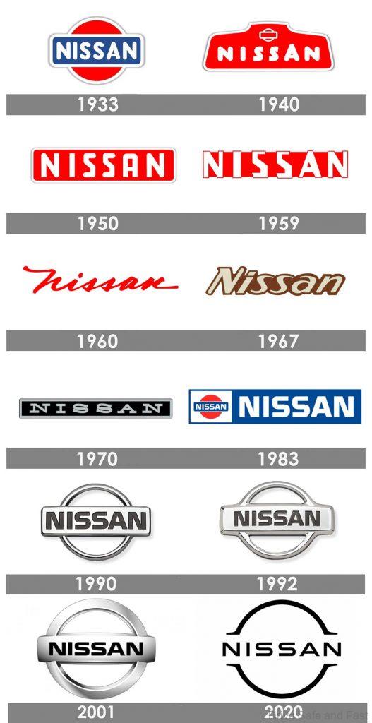
The first thing to note that the name “Nissan” translates roughly to ‘Birth of the sun”, which can be seen reflected in the company’s first logo. It features similar motifs to the modern day logo, but with a red sun in the background.

The story starts back in the 1930’s. Dreaming of creating a strong Japanese auto brand, Yoshisuke Aikawa merged his holding Tobata Foundry Co., Ltd. with Nihon Sangyo and Dat Motorcar Co. (whose predecessor started producing DAT cars back in 1914) Together, this unified company was renamed NISSAN – selling cars badged under both the Datsun and Nissan names.
This is what gave birth to Nissan’s first brand logo in 1933. Inherited from the Datsun design (see interactive image), it utilised the same style of emblem motif, featuring a blue rectangle with the brand name inscribed in white letters, together with a red circle in the background which symbolised “a rising sun”.
In the 1940s, the Nissan logo moved on to a geometric figure with 6 angles. The outline of the original logo can still be seen at the top. The “Nissan” script now featured sharply cut “S” letters and a large “L”.
In the 1950s, the logo transitioned to a rectangular shape with rounded corners. This logo was briefly changed to look like the one below towards the end of the 1950s.
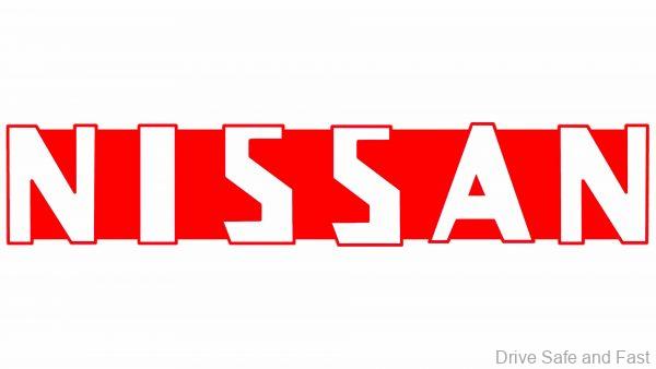
When the 1960s rolled around, we got a more expressive cursive logo. Though red in most cases, the logo was finished in silver or chrome when featured on vehicles.
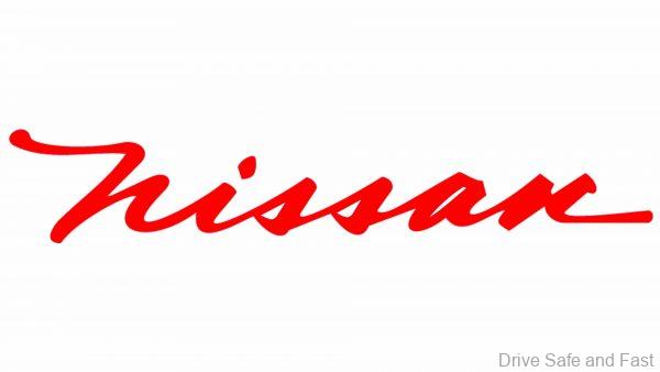
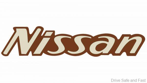
The strangest period came towards the end of the 1960s, when a brown logo was used and the cursive script was dropped.
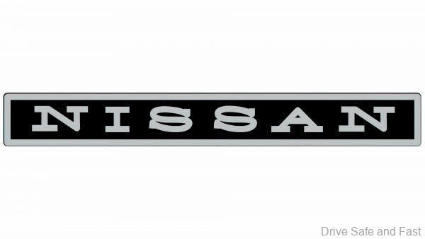
With the start of the 1970s came the return of the rectangular logo. This time, the typeface was truly modernised and professional looking.
1983-2001 were the golden years for Nissan. The brand was churning out world-beating rear-wheel drive sedans, coupés and untouchable all-wheel drive track machines. It’s fitting that the logo in this era was a blend of modern and traditional.
Nissan married some aspects of their initial logo with scripts of other logos it had employed in the past too. But the aesthetic used now was cleaner and more pleasant overall.
The early 2000s were when Nissan’s troubles started to brew. The company had been overspending in the 1990s and couldn’t end its financial woes. It entered into an alliance with Renault and with this new era, came a new logo. It was a lot like the initial logo, but the Japanese-inspired rising sun red was omitted entirely, perhaps symbolizing some loss of independence and signalling a more globalised brand overall.
Just last year, the brand unveiled a new logo. The overall design has been reduced to its basic elements.
Representing a new era of seamless, intuitive and electrified mobility, it’s also adapted for the smartphone age, where clean graphics stand out on pocket screens.

