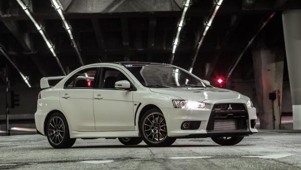
It is no secret that Mitsubishi’s decision to shift its focus towards crossovers and SUVs has led to death of the long-running Lancer nameplate. While the departure of the famed compact sedan has irritated JDM enthusiasts, you can’t really blame Mitsubishi for wanting to jump on the bandwagon and chase the almighty dollar. At least they know that selling Tritons was no longer enough to keep the business afloat.

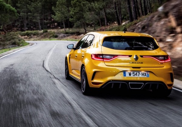
Until now, there is no concrete evidence that the Japanese marque is ready to revive the Lancer and its revered Evolution derivative. There were reports last year that suggested that the next Lancer Evo could share the Renault Megane RS’ powertrain but whether the idea will come to fruition remains to be seen.
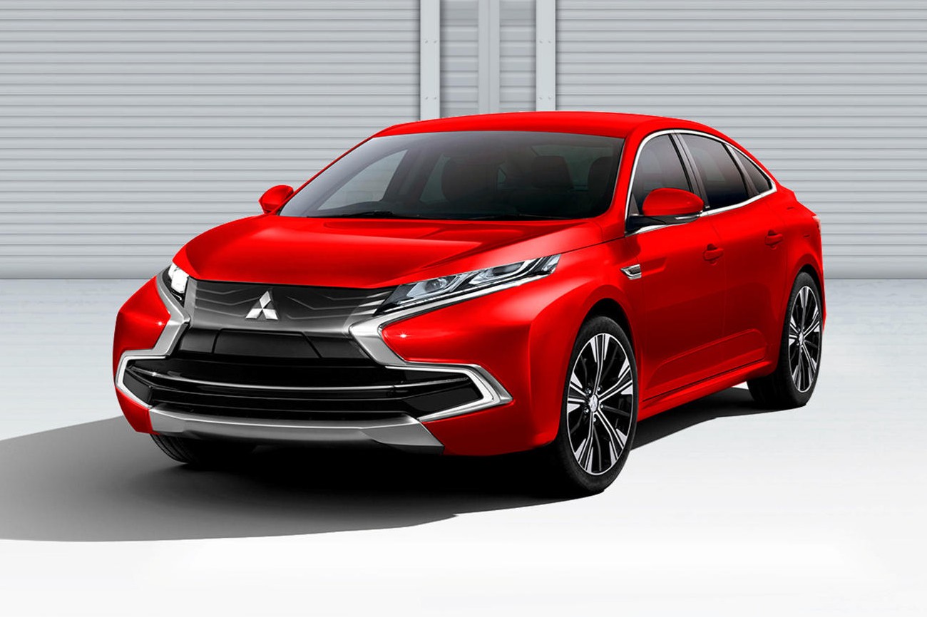
However, if Mitsubishi one day decides to resurrect the Lancer as a sedan and not as a crossover like how they did with the Eclipse, Kleber Silva or KDesign has a design proposal that could be worth considering. It is not easy to come up with a better design than the last Lancer, which I personally consider to be timeless, but the digital artist seems to have a done a decent job incorporating the brand’s proprietary Dynamic Shield into the design.


That said, at first glance, Silva’s digitally-rendered Lancer appears a tad too bulbous for my liking. This is heavily contributed by the gaping lower air intake that stretches into each corner of the bumper, which in turn makes the fenders appear swollen. Reducing the size of the intake would be the best thing to fix that face. Thankfully, the upper section of the fascia looks sharp, thanks to the seamless blending of the headlamps and the grille.
Without the side view rendering, there’s not much to tell about the profile of the Lancer except that it looks less aggressive now that the strong character line is gone. The line is replaced with a moulding at the bottom of the doors, which does not seem to do much. The chrome window trim, slightly raised beltline and shark fin antenna manage to spruce things up a bit.


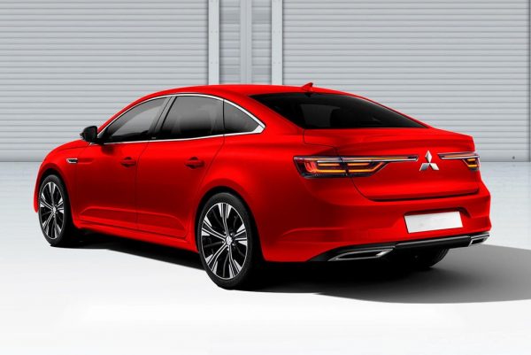
Around the back, things appear a little better, albeit familiar. The long taillights flanking the Mitsubishi emblem, which looks bigger than it should, are clearly borrowed from the Renault Koleos and Megane but they seem to fit nicely into the rear haunch. For the finishing touch, Silva also included a pair of trapezoidal exhaust tips as well as a short chrome strip into the subtle diffuser. Nice but it’s nothing to shout about.
The rendering is promising to say the least but don’t get your hopes up folks because there is not the slightest of hint that Mitsubishi is going to revive the Lancer. Moreover, the brand seems to be doing great in the crossover and SUV market with their Outlander and Eclipse Cross. That is, unless the Renault-Nissan-Mitsubishi alliance wants to shake things up a little bit.


