Earlier this week, BMW finally revealed the new 4 Series Coupé, which caused the greatest rift in opinion for the brand since the BMW E60 was first shown. On one side of the argument, people were saying the new grille looked like buck teeth, giving the 4 Series the face of a beaver.
On the other extreme, BMW designers were praised for breaking the mould with a sleek design. There were plenty of middle-ground votes as well. Some, like us, took the position that the sales would ultimately determine if the car was a success. Plenty of good looking BMWs have underperformed, while controversial designs like the Chris Bangle 5 and 7 Series were top performers in their time.
Personally, I decided to take note of my initial reaction and later start examining aspects of the 4 Series in more detail before I gave my own opinion.
I will start by stating what I like about the design:
- it is innovative. We’ve seen other brands, like Audi, trap themselves in a particular design language for generations. It’s good that BMW have found their own way out
- it is sleek. There’s no denying the car looks fast. Proportions are right and there are no glaring mistakes or excesses here (unlike on the 2 GC)
Now, here’s what I really don’t like about the design.
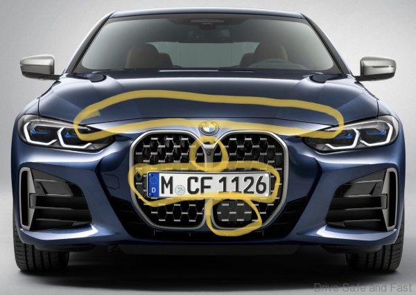
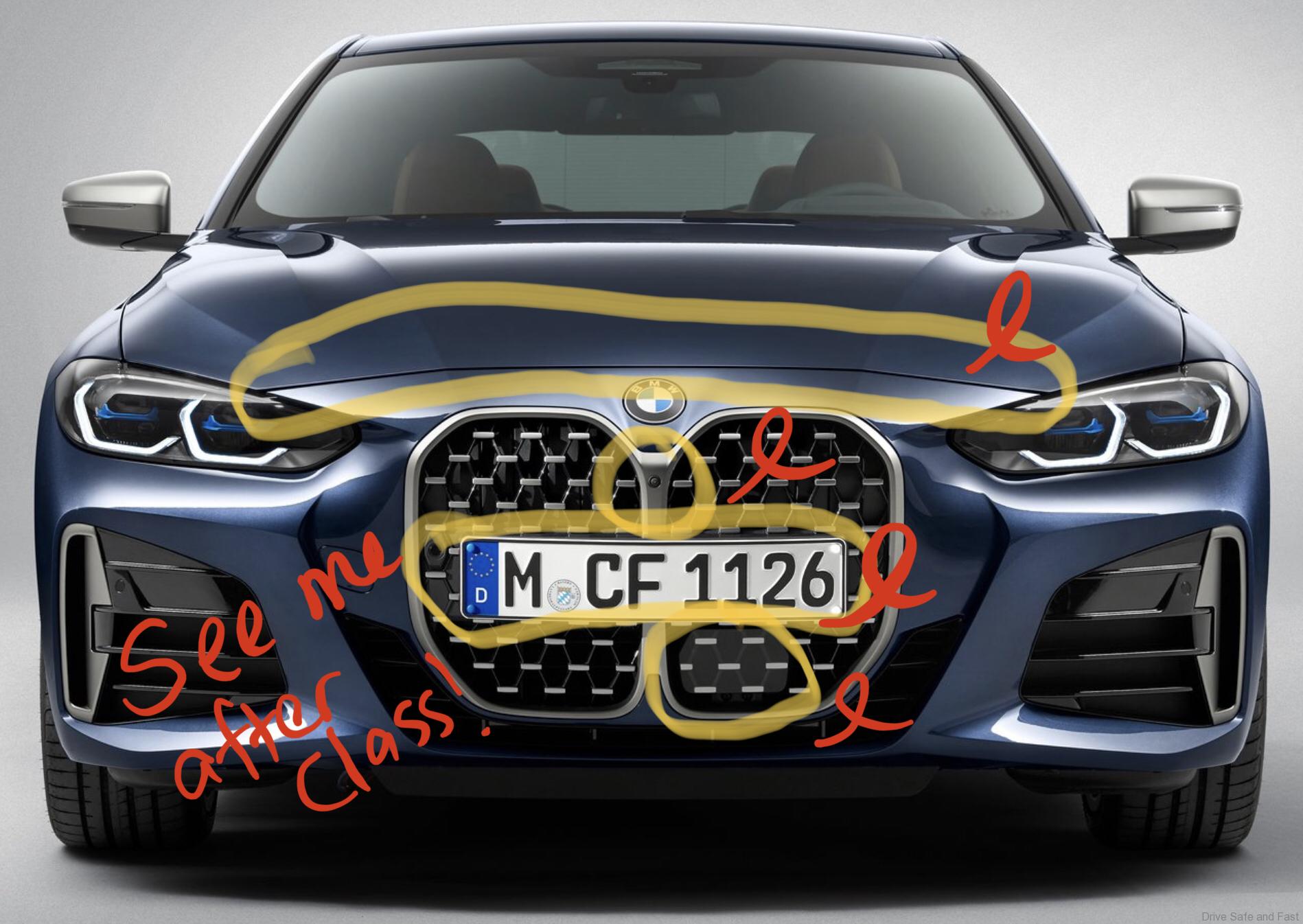
1. The hood doesn’t meet the grille.
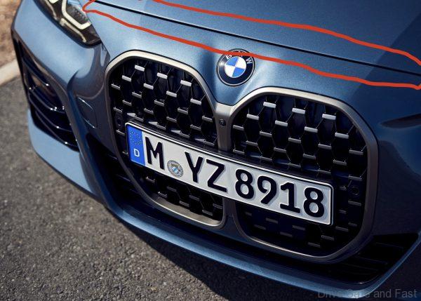
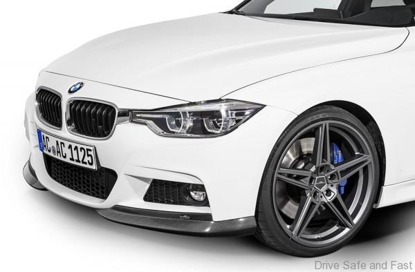
Why is this a problem? After all, some great BMW designs, like the F30 3-Series also has a hood that doesn’t meet its grille.
Two reasons.
Firstly, BMW’s current design language has gotten it out of this phase. Look at the new G20 3 Series.
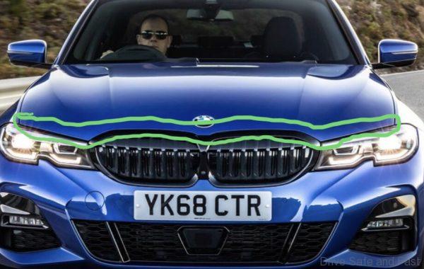
They’ve closed the gap on that one, as they have on the rest of their current sedan lineup. I see this seperation of hood and grille as a bit of a production shortcut to achieving a certain design. These designs look good from afar, but upon closer inspection there are panel gaps where they should not be. Designers and engineers did not work closely enough to make these lines disappear or relevant to the vehicle’s design.

Secondly, it’s not a seperation we see on the Concept i4 model.
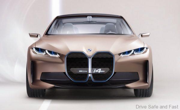
On the Concept i4, the hood extends all the way to the headlight cluster and grille. Again, the designers and the engineers didn’t work together at an early stage to clear this issue and the result is a line where it was never meant to be.
2. They didn’t make good use of the new grille
On the Concept i4, BMW went on and on about how the new grille would be more of an Intelligence Panel than a grille. I get that the 4 Series Coupé is not the same car, and not fully electric so it does need to provide airflow. The problem is BMW were quite sloppy with functional elements like the sensors.
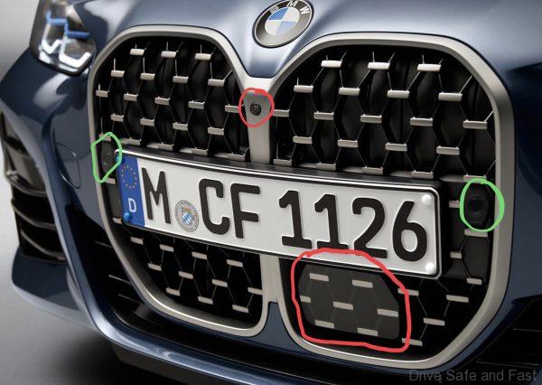
See, the parking sensors were integrated nicely (green circles) but the front camera and AEB panel were just tacked on without properly integrating it into the design. I often thought the reason why BMW has been slowly conjoining the grille over the years was to better hide and integrate sensors in the centre. Instead they go and give the grille a light coloured finish, which exposes the dark front camera, and they rely on the same 2 dimensional grille print-on-sensor tactic that has plagued modern car design for about ten years now.
3. License Plate placement is Distracting
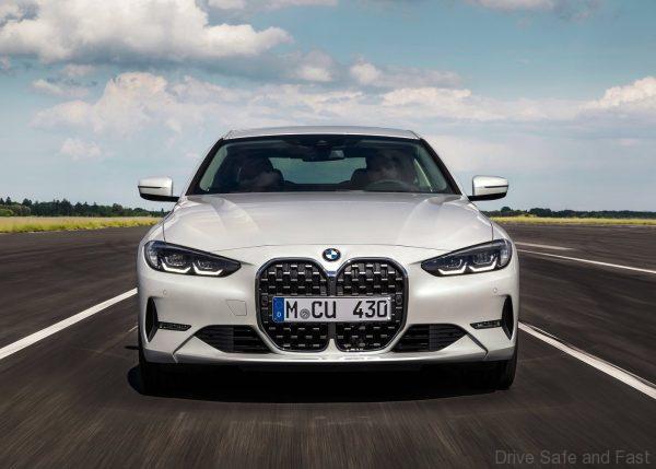
Take a look at the new 4 Series without a license plate of any kind. That thing looks sleek. It looks aggressive and purposeful.
Now, look at it with a license plate on. It’s almost as if designers forgot that cars needed one and didn’t bother to make the adjustments.
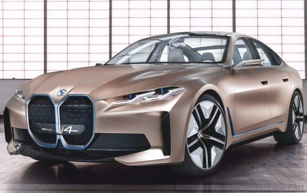
On the Concept i4, designers used a transparent plate and probably prayed some engineer would figure things out later on.
Of course, we don’t expect a transparent license plate, but perhaps some other solution would have worked. Look at how Audi deals with a large and tall grille on the A5 Coupé.
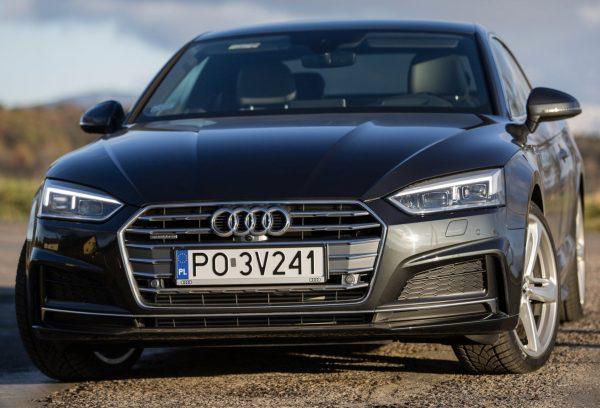
The grille section where the plate is mounted is purposefully blanked out and that makes a world of difference.
Now, with a conjoined kidney, this may not be as easy to do. So there are other options to consider. Here is one.
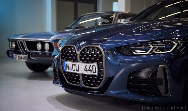
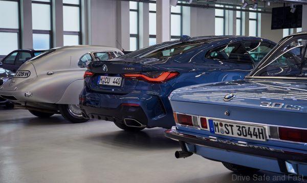
BMW wanted to give this new conjoined kidney some legitimacy by showing that their past models too sported tall, conjoined kidney grilles. I mean, this was literally the cover photo for the press release.
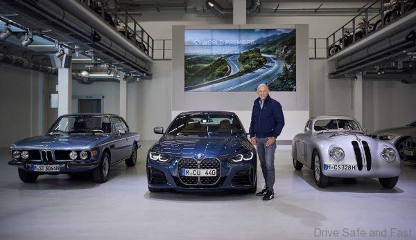
Look at that car on the far right with the tall kidney grille, the BMW 328 Coupe. If that car could pull off an off-centre number plate, BMW could have reasonably put an off-centre number plate on the 4 Series Coupé and complete the idea of it being an homage.
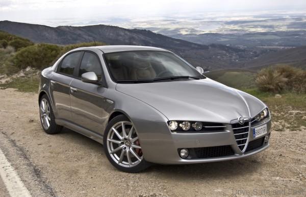
Other good looking cars like the Alfa Romeo 159 also pulls off a tall grille by using this trick. Does it look any worse for doing so? Judge for yourself:
