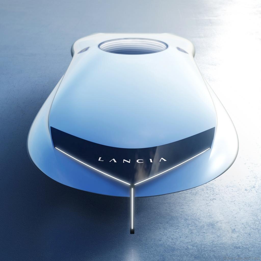
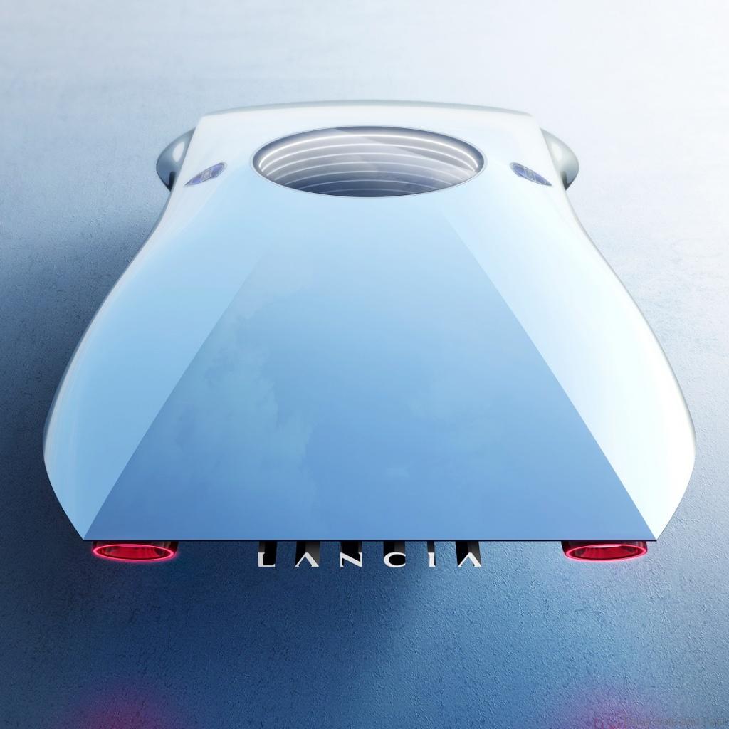
Lancia shows the Pu+Ra Zero sculpture teasing a new EV
Italian car maker Lancia recently held their Lancia Design Day and debuted two very interesting things. The first was their new redesigned logo and the second was a sculpture called the Pu+Ra Zero which gives us a glimpse into the brand’s future design language and what a Lancia electric Vehicle (EV) may look like.

Lancia also announced its collaboration with Italian furniture company, Cassina, on the interior design of its cars. The Italian automaker also explained that their new design language called “Pu+Ra” is based on the words “pure” and “radical” introduced by Jean Pierre Ploue and his team at Lancia’s Style Centre.
Moreover, Jean Pierre Ploue also says that this new design language is set to “define the design of Lancia for the next 100 years.” I honestly don’t know if these extraordinary ambitions will be attainable for Lancia but based on the design of this sculpture, I definitely think that it is possible.
On top of that, Lancia also calls this new design language which we will be seeing in their cars moving forward as “progressive classic,” and quite frankly, I find that a bit confusing. Personally, I prefer to think of this design language as futuristic, but I am fairly certain the brand could pull off a classic yet contemporary design.

However, I do need to point out that the Lancia “Pu+Ra” sculpture does not really look like a car, so much as it looks like a one-seater space ship and even though I am a bit biased as a huge Star Wars nerd, the design kind of gives me a whole Anakin Skywalker’s podracer feel but more realistic.
On the other hand, I absolutely love what Lancia has done with the new logo and I especially like the new colour scheme with the more glossy finish as it looks more upscale to me. Plus with the vertical line being moved to one side rather than being in the middle the whole thing looks more seamless.
Where the previous design of the Lancia logo made it look like the colours were clashing a little bit, the new logo does a good job of making the silver colour blend better with the blue. If all future Lancia cars look as good as the brand’s logo, I think the company could find major success in many markets.

Well with all this and the collaboration with Cassina, it looks like Lancia is entering a brand new era or at the very least, undergoing a massive makeover. Either way, I am excited to see what the brand produces next. Are you?
