They are distracting us and we prefer knobs and buttons
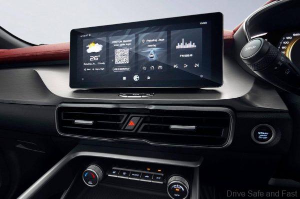
Large, interactive touch screens are becoming increasingly prevalent in passenger cars; in the case of Tesla, they are the only control interface. They are lovely to look at, but they might be more confusing than having physical controls. Distracted driving is an increasingly dangerous problem and it starts from touch screens in your car and the need to ‘look’ where you touching and not ‘feeling’ a physical knob or button on the center console.

The iPhone started the touch screen craze and that’s fine with us as when using a smartphone, all eyes are on the screen. However, with any car, all eyes are on the road ahead and a touch screen is very difficult to get used to as your fingers cannot memorize the positions of each function on the touch screen. Add to this the reflection from the sun at the ‘wrong time’ and in the ‘wrong angle’.

According to NHTSA, 10 per cent of all fatal crashes from 2012 to 2017 involved distracted drivers. Mobile phones are a major cause of distraction, as we’d expect, but they’re an even bigger problem for younger drivers.
In December 2017 Ford Motor published the results of s study where parents were the most distracted drivers in Asia Pacific. Parents often worry about screen addiction for their children, yet the data shows that adults find it hard to disconnect too.

Yes, knobs, buttons and slider switches are boring, but a driver can easily memorize their positions and use after a few weeks with the car or even sooner. Also, it reduces the need to ‘play’ with it when in heavy traffic.

“If you use a touchscreen in a car that is complicated, it’s distracting and not a good experience. But something like Apple CarPlay, or Android Auto, that is bringing in an interface that you’re really familiar with, that feels natural, intuitive, that you’re used to dealing with on your phone all the time. That’s actually a place where I think the design of that interface in a touchscreen works really well for that,” said Mark Webster, director of product at Adobe and an expert on the use of voice in UI and UX design.

Will Voice Work Better?
Maybe the only solution is to shift the interface completely to voice. Both Google and Apple have voice-recognition functionality built in, allowing you to access and use a variety of apps via simple speech while you’re driving, generally by pressing the ‘talk’ button in your car (normally found on the steering wheel). Issue, does it really work efficiently all the time or even 50 per cent of the time? Well, in our experience with a number of high technology in car systems from China, Germany and even Japan, we have not been able to get even 50 per cent efficiency with voice activated in car entertainment systems.

The advantage of these systems is that smartphone makers are constantly expanding the functionality and availability of speech-activated apps via their systems, meaning your car should be able to follow more and more voice instructions in time.

We have tried the Proton X70 system, Hi! Proton with disappointment. Then there is the Mercedes-Benz system, Hey Mercedes! Which works a little better, but it is not perfect. In March 2019, BMW introduced their version which is called ‘Hey BMW’ and even this BMW Intelligent Personal Assistant voice command system had its ‘moments’ with us.

Voice commands is the next solution and we wait for a better system to emerge from the auto industry soon. Meanwhile, touchscreen rules and we will have to adapt when test driving new cars.