It’s almost universally agreed that the new BMW M3 and M4 are some of the most difficult cars to look at. It’s not that they’re ugly, it’s more that they’re unsettling. It feels like shoddy design work. We have our own gripes with the design, but we are also aware that BMW designs tend to look better in the metal. And some of their more revolutionary designs can age gracefully OR boost sales.
Take the E60 5 Series. That car still looks pretty modern despite being about 17 years old now. That same era had BMW producing the E65 7 Series, which, though unsettling to look at, sold like hot cakes.
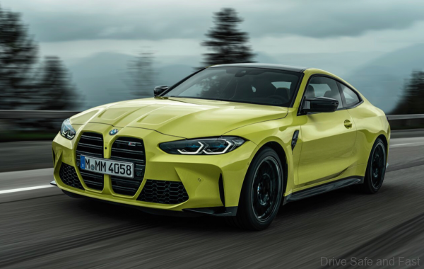
Rather than sit around and complain about the design of the new M4 being not-to-their-taste, Prior Design have stepped in to work on an aftermarket bumper for the new M4. They haven’t settled on the final details, but here’s what they have so far.

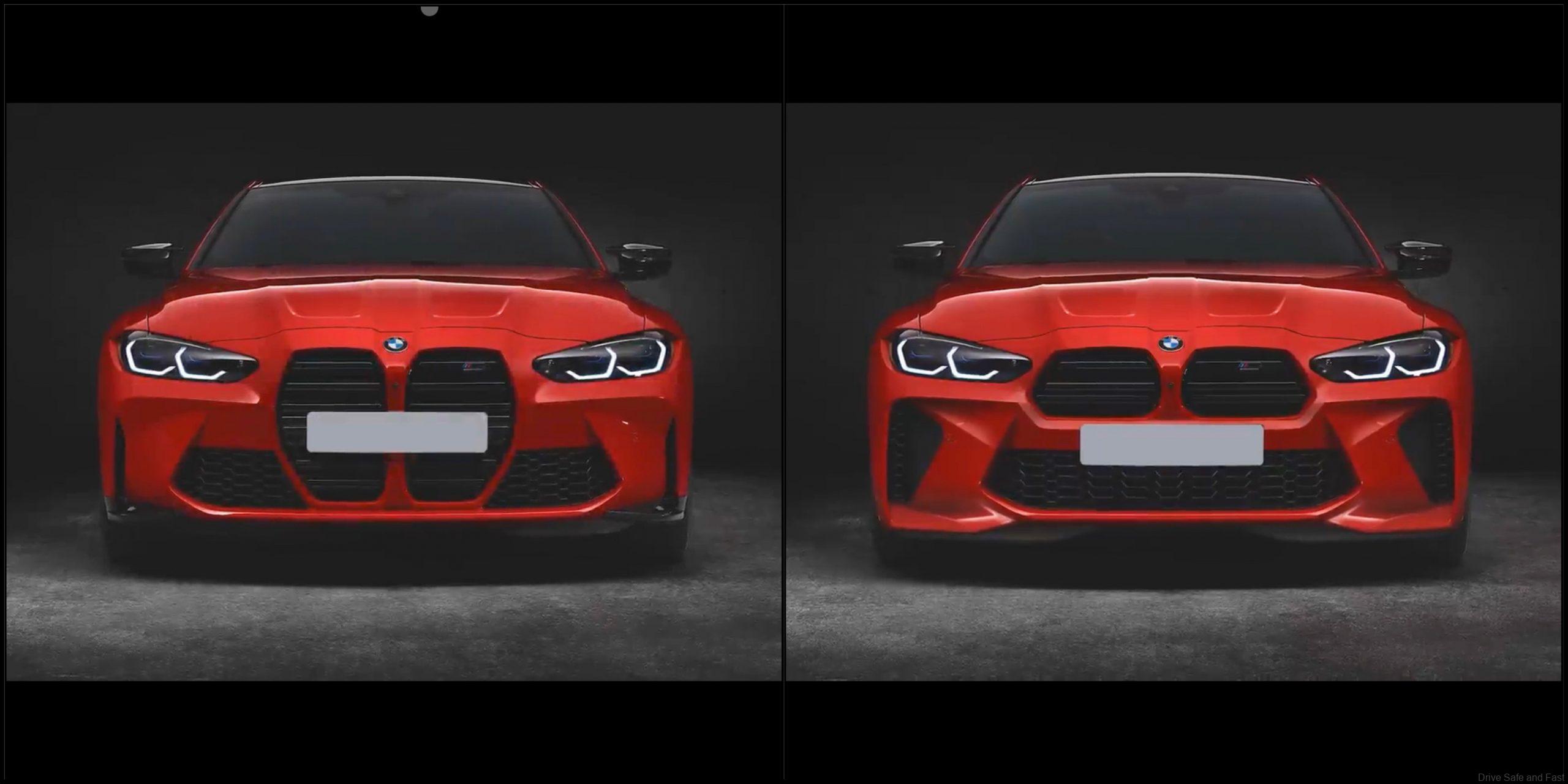
Here’s a front view of the original BMW M4 in red.
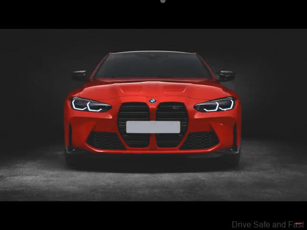
Here’s what Prior Design are thinking of doing with its aftermarket bumper:

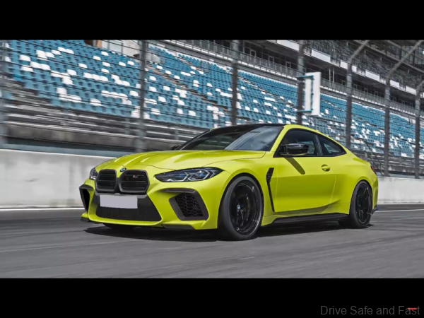
Now isn’t that just a lot better overall. It just feels more ‘BMW’ than what BMW themselves have planned. That being said, Prior Design haven’t settled on their final design yet. They also took the opportunity to try other things out, including the 8 Series grille:
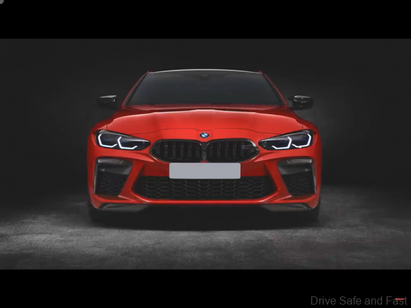
This also works pretty well with the rest of the new M4’s face, and we’ve seen renders that merge the 8 Series grille on the 4 Series face before. The only big problem with going with this option is that it sort of loses its identity a lot. Fun to see, regardless. They also did a version of the above with a red highlight on the front lip.
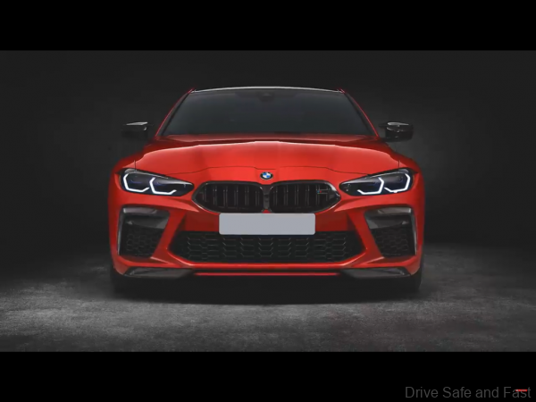
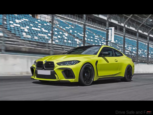
The lower half of the bumper is obviously a big consideration for Prior Design. Without a starting point from BMW themselves, they’ll have to improvise and try a few things out to see what works best. To that end, they’ve rendered some examples of different lower bumpers and even grille surrounds.
Here’s the first set, which has a body coloured grille surround. The first design is the simplest, with large air intakes on either side and one in the centre. Smoothe surfaces are used throughout with some of the same creases from the original design making their way into this one.
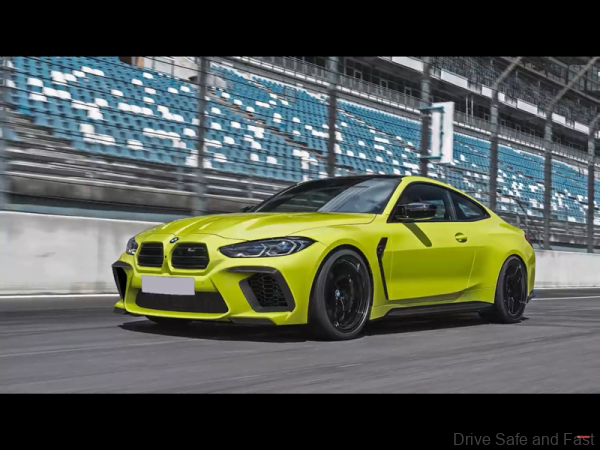
They also tried this design with an additional element to the central air inlet in body colour.
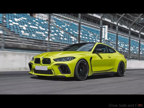
The other design changes things drastically. There are a lot of new angles and the air intakes have been reshaped drastically.
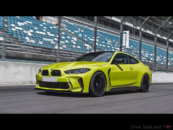
Then you have this design with the front grille in a black surround. There are two takes, one with the simpler central air intake and another with the additional body coloured element.
Watch the full video (in German) from Prior Design.

