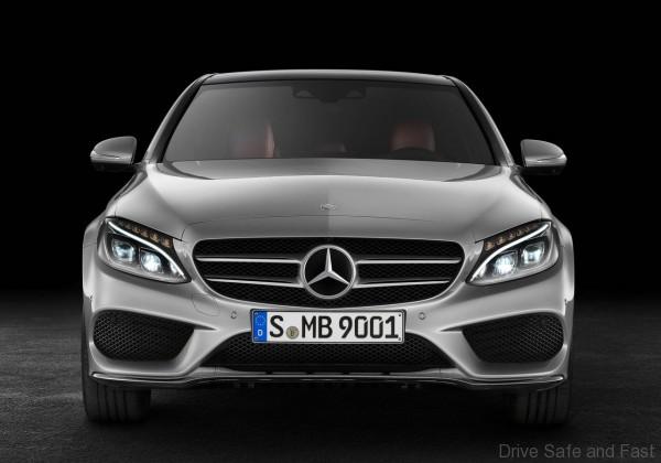
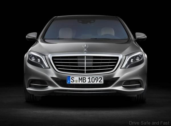
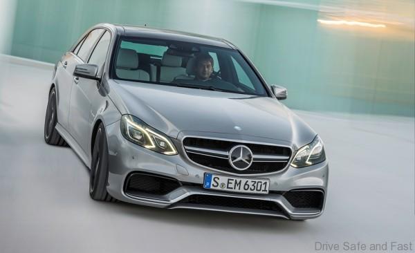
The most common complaint we hear of cars nowadays is that they all look the same, especially within a certain brand. Just about every profitable car brand carries a strong ‘family look’ nowadays, but it was the German premium car segment that brought this idea into popularity. Brands like Mercedes-Benz have a extremely large portfolios yet very recognisable design. In fact, we’ve dedicated whole articles to showing you the difference between core Benz products in terms of design and proportion. But today we want to zoom into one aspect of the E-Class and why they may have designed it differently from the C- and S-Class.
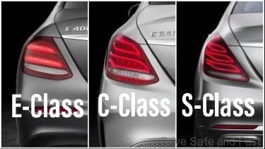
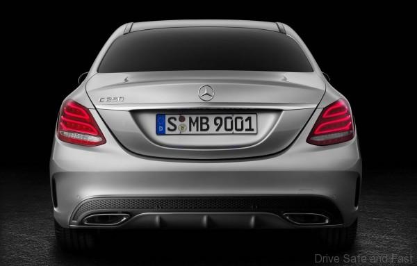
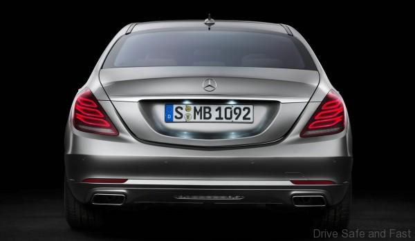
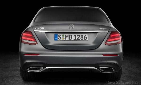
Take note of the light clusters and how the panel gap between the bumper and the rear quarter panel is positioned. In the C-Class and S-Class, the panel gap intersects the light cluster. In the E-Class, it sits perfectly on top the light cluster. As such, the E-Class light cluster takes a more ‘squarish’ look compared to the C- and S-Class.
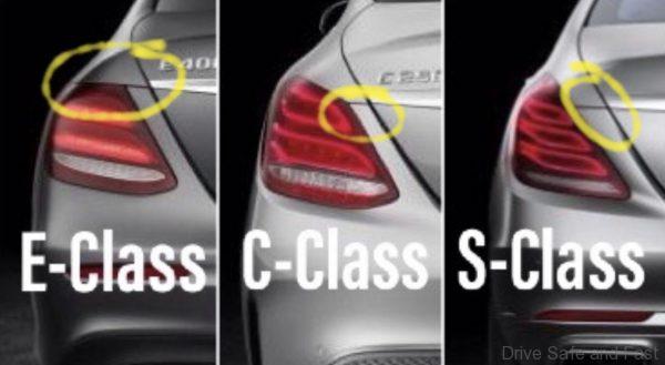
For the longest time, I didn’t think much of it. Perhaps it was just a way for Mercedes-Benz designers to give the E-Class a little more character. But then one day I realised that this was a German car company. So the decision was probably not at all made for emotional reasons. Immediately, I remembered something important: the E-Class was an entire life cycle behind the other two.
The way most brands update their models is to give it a full model change every 5 or 6 years, and give it a mid-life facelift every 2-3 years. Annual updates also happen, but these are less common. With the Benz, the full model change between these three core sedans happens first with the S-Class. About a year later, we usually get to see a full model change on the C-Class. It takes another year (or more) for us to see a full model change of the E-Class. So that’s often 2-3 years of the E-Class looking like a previous generation product next to the S-Class and C-Class.
But in the previous generation, Mercedes-Benz dealt with this problem by giving the E-Class the most extensive facelift possible with the W212 E-Class. That facelift of E-Class merged the headlights, took on much curvier shapes (the original full model change on the W212 was extremely angular), and darkened the head and taillight clusters. These were enough to keep the E-Class looking like it was part of the big design shift and be sold alongside the W222 S-Class and W205 C-Class. What’s more, Mercedes-Benz Malaysia still managed to hit record numbers with this facelifted E-Class.
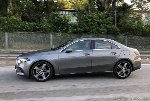
With the next generation of Mercedes-Benz products, we know they’re going for what’s called ‘Sensual Purity’ in terms of design. We’ve seen this on the A-Class Saloon and the CLS. And the company is currently testing out the full model change S-Class for next year’s launch. The car that will come after that will be the all-new C-Class. Between those two launches, we’ll probably see an extensive facelift of the E-Class.

So coming back to the weird panel gap on the current E. Why does it exist? Well, because Mercedes-Benz knew that the E-Class would be half a life cycle behind. By the time it hit its facelift, the S-Class and C-Class would have received or be in the midst of receiving full model changes that moved them into the ‘Sensual Purity’ design language. Now take a look at where that panel gap sits next to the CLS.
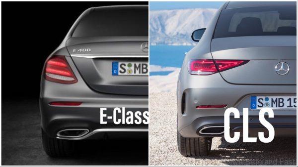
My theory is that the Facelifted W213 E-Class will take on certain ‘sensual purity’ cues, especially at the rear. You can even see how they deliberately put the foglight/reflector higher up on the E-Class than they did on the C-Class and S-Class.

