Mercedes-Benz revealed their updated GLC at the 2019 Geneva Motor Show. Some changes are obvious, but many are subtle. We put the original 2016 GLC model next to the 2020 facelifted model so you can really see the visual differences.
Grille
From the front, changes to the headlight cluster, grille and bumper are pretty apparent.
Interior
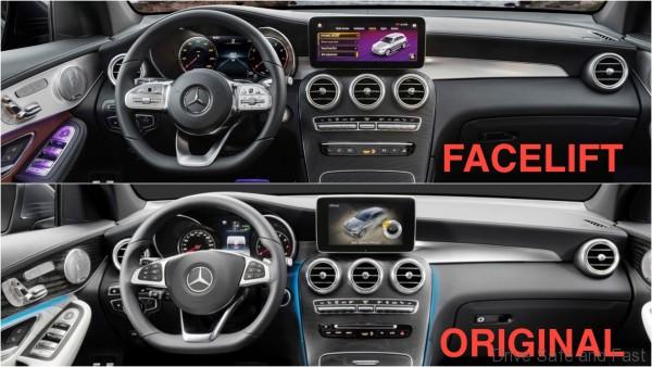
The steering wheel has been redesigned. The horn pad is now completely circular and the wheel itself has seen some minor alterations. The instrument cluster is now completely digital and the infotainment system’s display is now wider with a slimmer aspect ratio. Air vents look to be unchanged on the new GLC though.
Side Sills
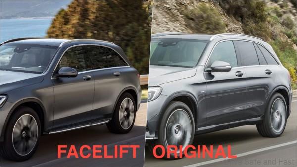
It’s a little unclear if the GLC Facelift featured here has a bodykit, but if it now comes with a side step as standard, then you’ll have that to look forward to it.
Rear
At the rear, the facelifted GLC lower bumper garnish and taillight graphics see the biggest changes.


